
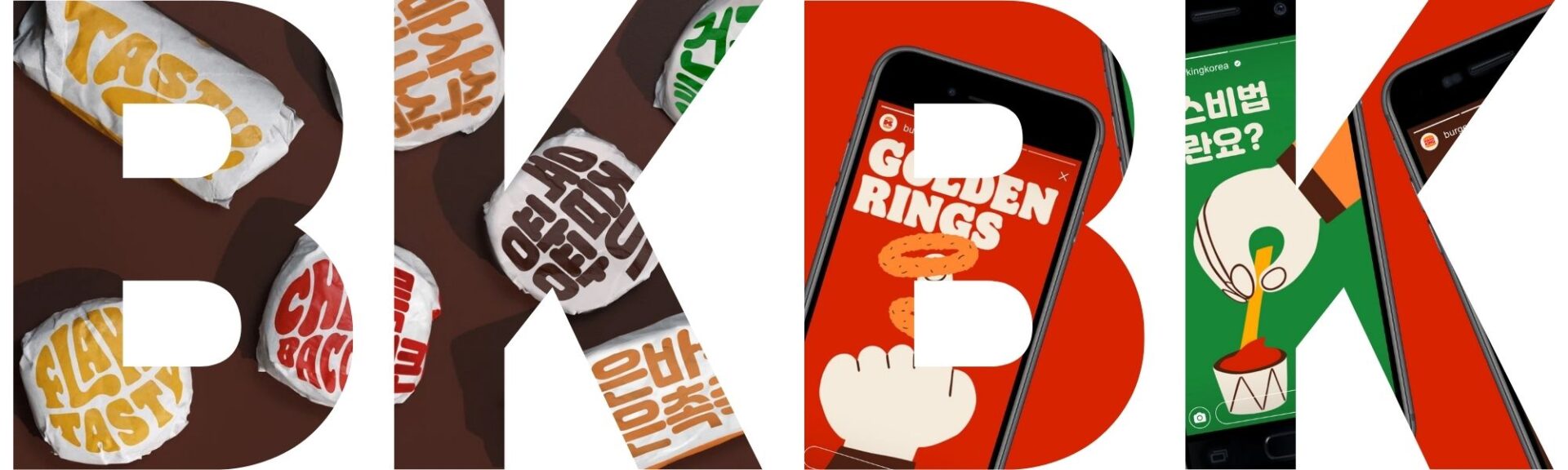
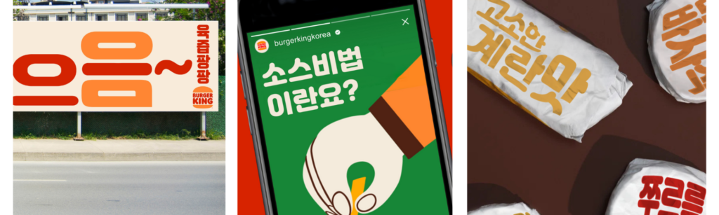
A major aspect of localization, especially when it comes to marketing localization, is desktop publishing. Using desktop publishing tools Adobe Photoshop and Adobe Illustrator, I localized 3 unique types of marketing material for my portfolio: social media, billboard, and food wrap packaging.
Given my passion for marketing and eternally unsatiated belly for burgers, I decided to do a localization of Burger King’s rebrand by Jones Knowles Ritchie. I loved the clean design and fun, bubbly typography of Flame and wanted to recreate this fun and fresh feeling in a Korean context. Burger King has a huge market in Korea, with over a whopping 240 franchises. Not only that, their marketing team is on-point. With all that initial project research, I was ready to roll!
Watch the video below to get a quick breakdown of the key parts of this project.
In addition to the project itself, I’d like to show you my process for deciding on this topic in the first place.
How to decide on a project
The first problem when it comes to a project is not knowing where to start or what to even work on. Do I go with passion? Purpose? Professional? Should it be mainstream or niche? I thought it would be helpful to share my decision-making process in narrowing down my project. Not only can this matrix apply to choosing what project you want to do, I believe it’s a simple and useful ideation template that anyone can follow.
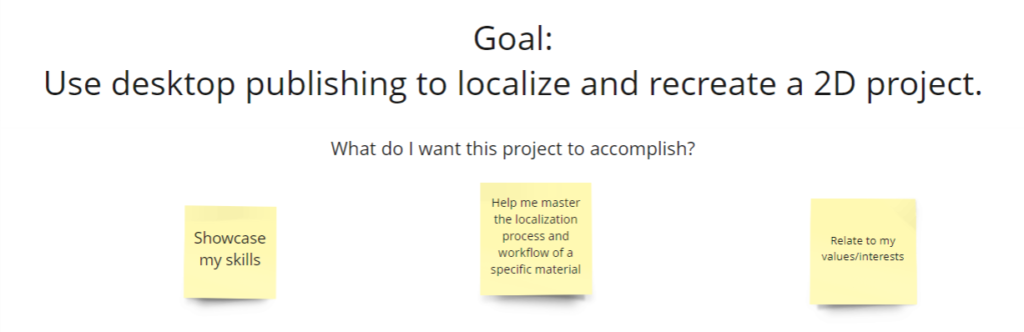
Start off with project goals and what you want to get out of the project 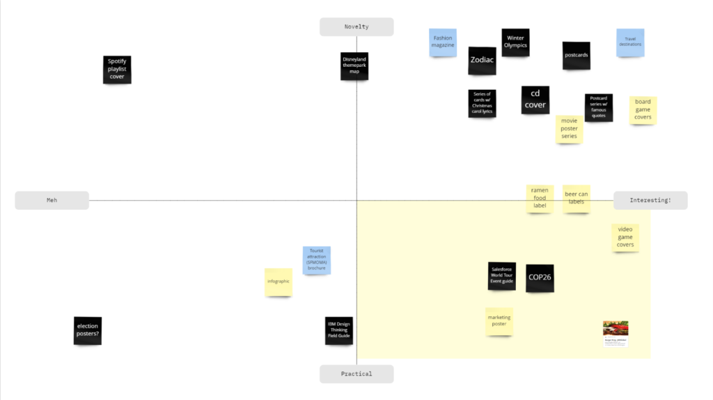
Come up with ideas (good or bad, just any!) and arrange them in a 2×2 matrix based on your project variables. (Here, I was choosing between a project that’s novel/practical and interesting/not.) 
Choose from the quadrant that best suits your project goals, for me it was a project that was fun and relatable to my localization niche (marketing/corporate). Take all the items that fit in that quadrant and order them 1-5 on how viable the idea is. 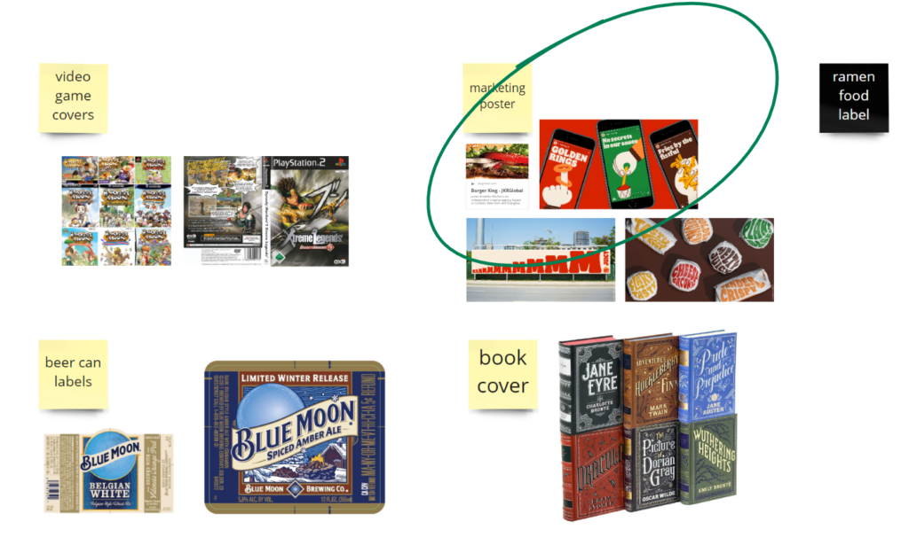
From the top 5 ideas, come up with real examples and map them on your board to compare.
On my Transcreation Process
Marketing is intrinsically a creative field. In choosing my material, I knew that a one-to-one translation of English to Korean would not bring about the same fun, exciting, and mouthwatering feelings the original campaign had. I knew this project required not simple translation, but transcreation of the text.
This was especially difficult when transcreating the text for the packaging. In any case, I started with a picture list in Excel as a space for ideation.

In English, you can call something crunchy, flaky, and crispy and they all mean different things. In Korean, 바삭바삭 is the only equivalent. This is why, on the bottom left, I translated “Flaky Tasty” as “천국의 맛 버거킹,” which directly translates to “Taste of Heaven, Burger King.”
While seemingly different, it still invokes the connotation of “tasty” and “scrumptious” that you get from the original. My favorite transcreation is “겉은바삭 속은촉촉,” which I received help on from a fellow classmate. (Transcreation, like any other creative process, comes out best when you ideate with others) The literal translation of this is “Crispy on the outside, tender/moist on the inside.” It’s got the same meaning as the English and has a similar edgy feel.
I gained a lot of inspiration from researching Youtube videos on Burger King and meokbangs, scrolling through the Korean Burger King Instagram page, and getting feedback from native Koreans and Korean-speakers.
On my DTP Process
Adobe Illustrator
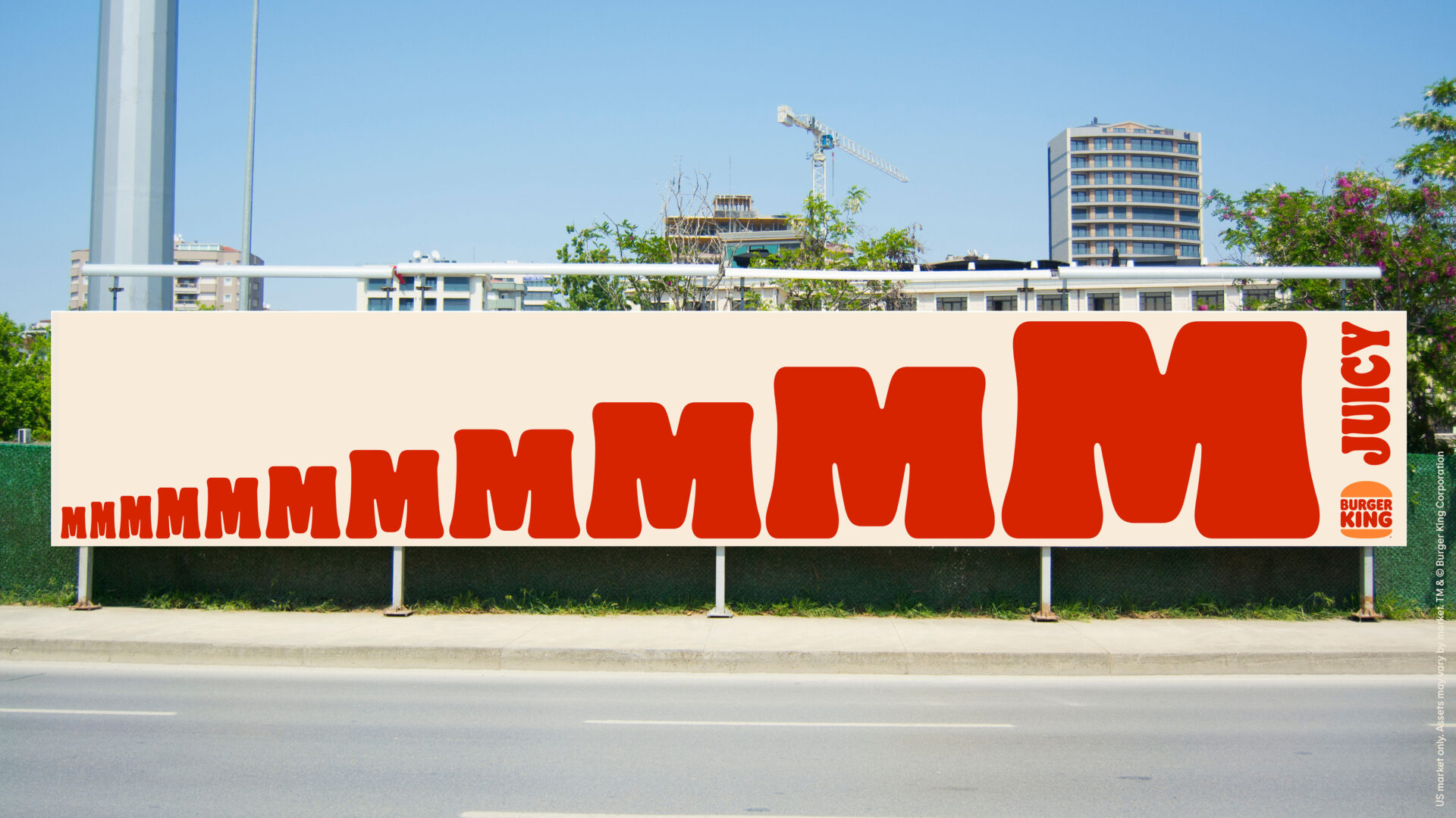
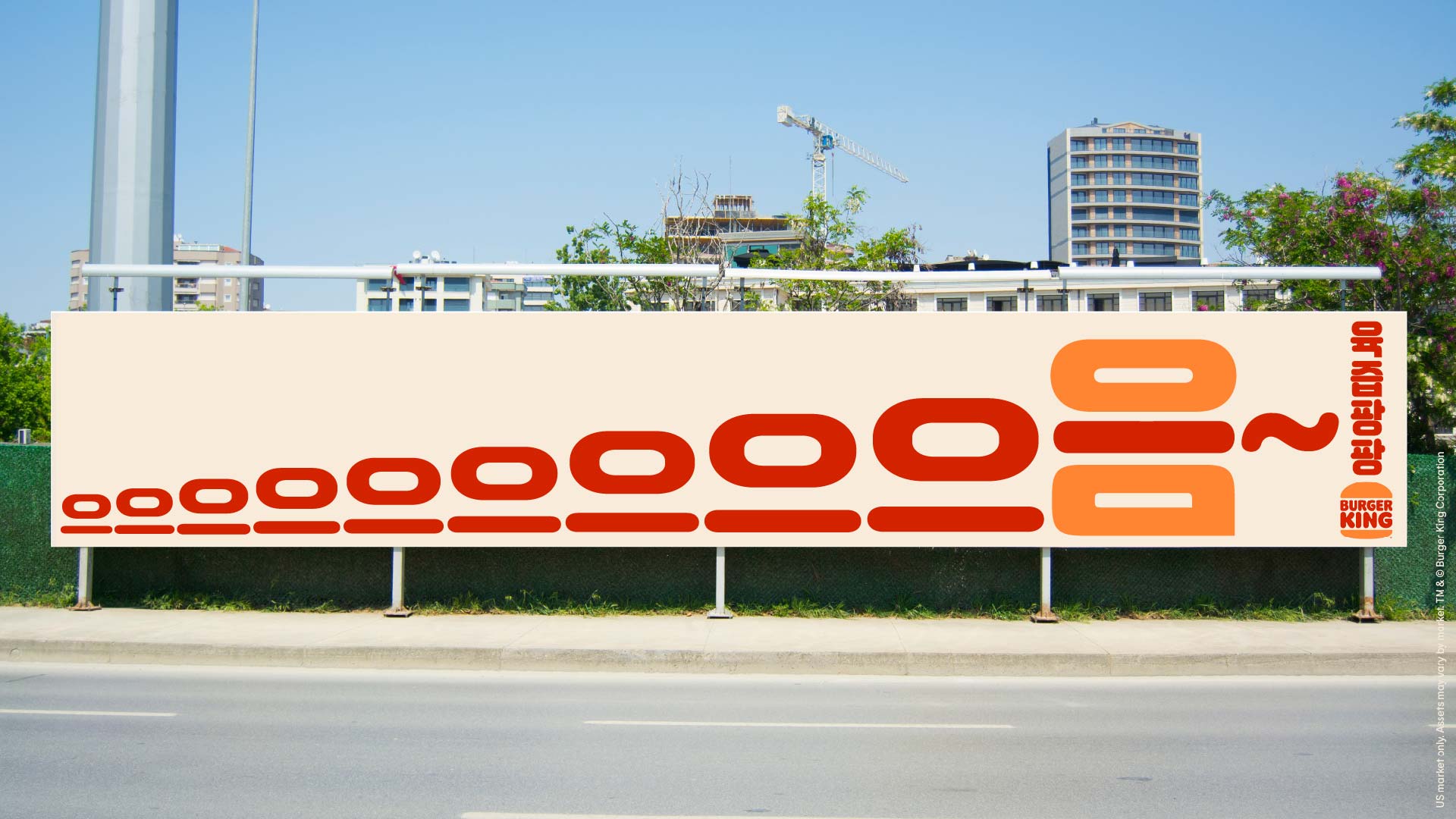
Due to its simple background, I knew I wouldn’t need to do much to prep the image for localization. I chose Illustrator for this image to give me more options to manipulate the text.
I simply hid the original text using rectangles and added new text using a font I found online called 잘난. It had a similar fun and curvy feel to Flames so I decided to go with it. My next challenge was sizing each character aesthetically.
Here are some design choices I made:
- Increased the stroke as characters got bigger
- Decreased vertical scale of all 으 characters to 80% to make them match the 으 in 음, which seems more narrow
- Created outlines of the text so I could manipulate the baseline
- Matched the bottom of each 으 so the ㅡ character would align with the bottom of the ㅁ
- Copied the 음 and erased the ㅇ and ㅁ characters, changed the color of the remaining ㅡ to red
- Then I changed the color of the original 음 to the BK orange
- Finally, I moved the red ㅡ character on top of the ㅡ in 음 and decreased the width to fit the width of the characters
- I’m sure you can catch what image I’m trying to portray with that final design choice. 😉
Making the 음 look like a burger wasn’t my idea originally. I shared my design with a classmate and she gave me the brilliant idea to try different colors. This is a crucial part of the design process in localization. Having a second or third eye can help you come up with new ideas you wouldn’t have thought up otherwise.
Adobe Photoshop
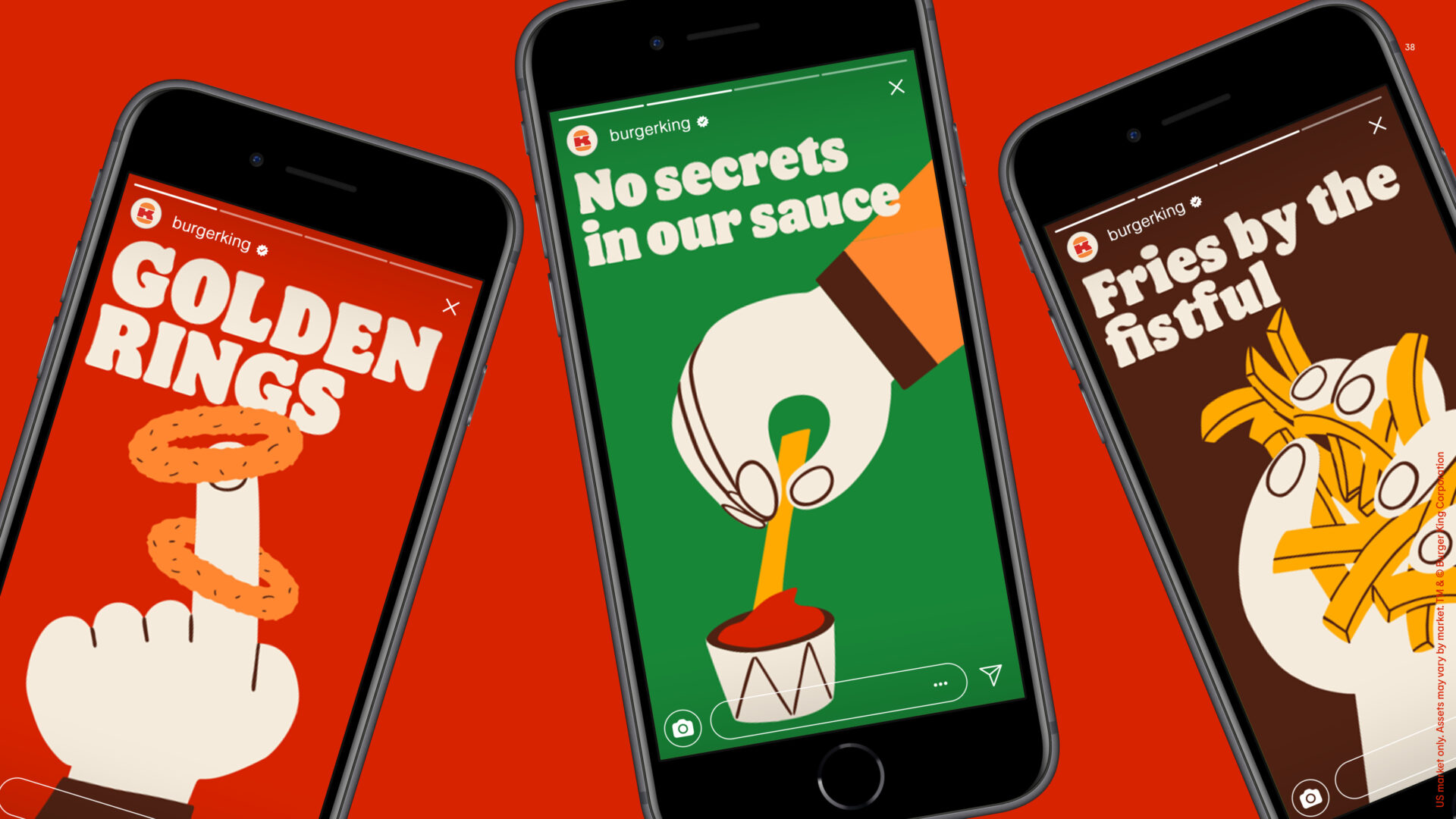
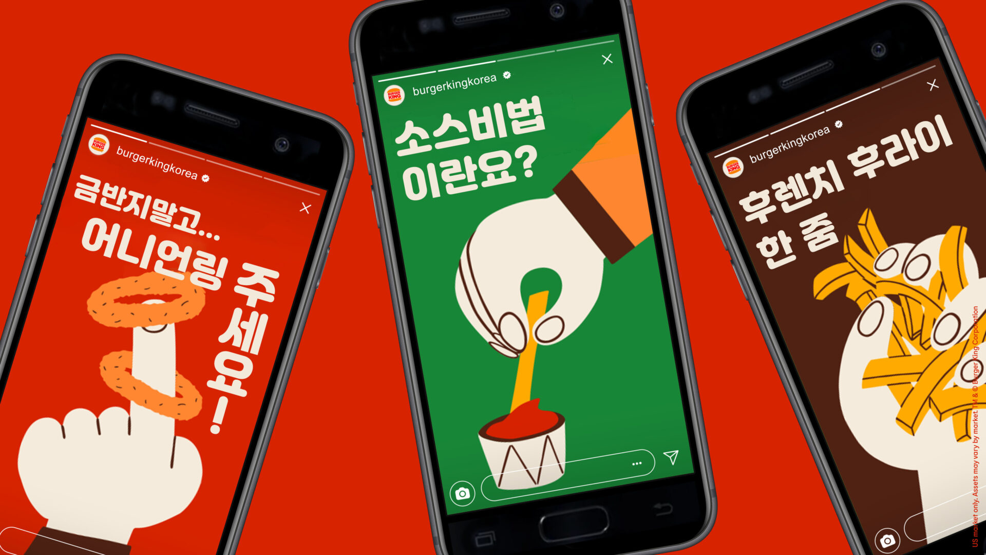
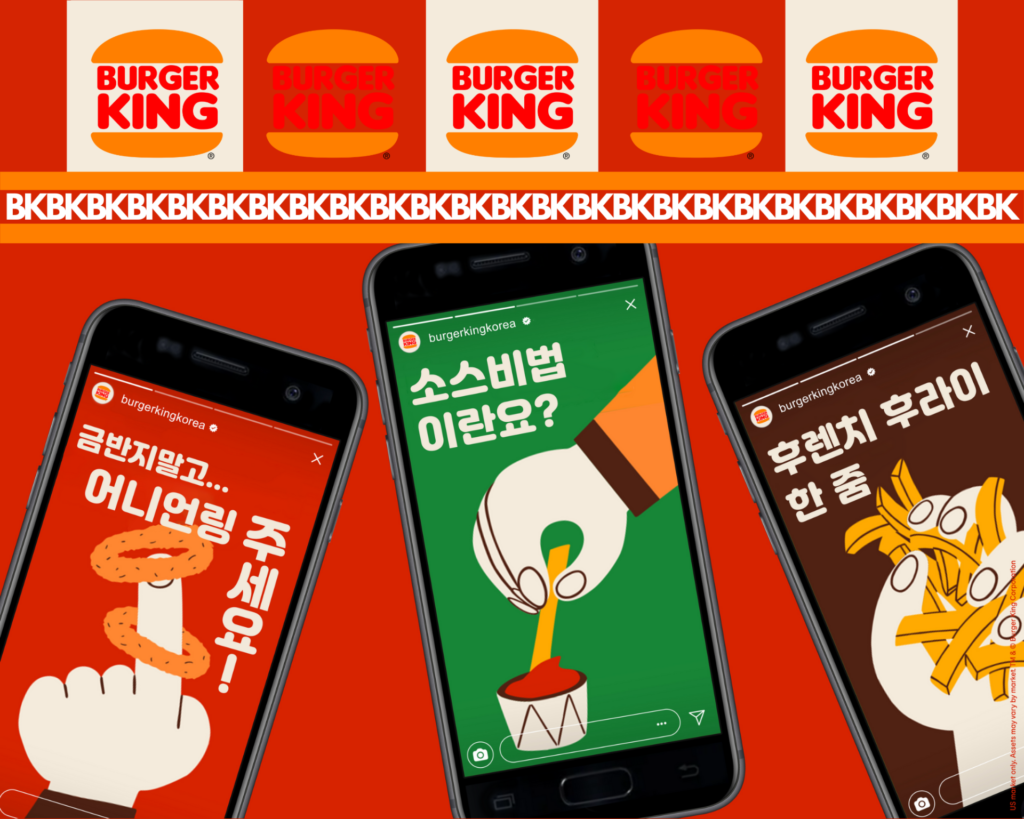
This localization required more changes to the images that simple covering up with shapes wouldn’t do. I decided to use Photoshop to give me more free reign in type and shapes in the image such as the BK logo and even the phone design (notice anything?)
Some localization choices to consider in this type of content:
- Localize the Instagram profile name. BK has their own Korean account under the username burkerkingkorea
- Localize the profile picture. While it’s still the same brand, I found that BK Korea uses the full logo instead of the K in the middle like BK US does
- Localize the phone. If you look very closely, you’ll see that the original iPhone design is replaced by a different phone design, ie. Samsung’s earlier editions. If I wanted to go above and beyond, I would have even replaced the entire case for the no-edge Samsung design
- Don’t be afraid to transcreate! “Golden rings” by itself doesn’t mean much in Korean so I embellished a bit to say “금반지말고 어니언링 주세요!” which translates to “Don’t give me golden rings, I want onion rings!”
Advanced Photoshop
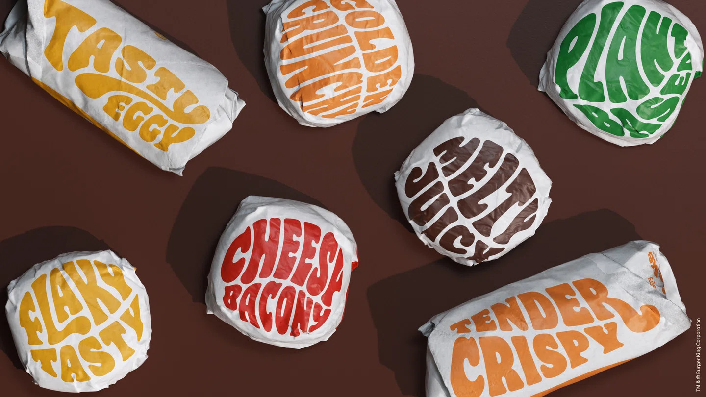

This was the most exciting and also most difficult to localize. Not only was the food wrapper texture hard to recreate, the funky font manipulations and physical attributes made it so that an exact replica would be impossible.
I got as close as I could using some of the Photoshop features mentioned below.
- Using the lasso tool to cover the original text
- Creating a clipping mask of crinkly paper texture I got from Google to give a texture effect to the wrapper
- Using Custom Warp to create misshapen text forms
- Used various blending features like Multiply and Light Burn to recreate the lighting effect
Overall, I’m very happy with how well this Burger King localization project went. I’m no graphic designer, but I have no doubt even a DTP specialist will commend these efforts. While this project was done for my portfolio, it has helped hone my skills in advanced DTP and transcreation. I’m already looking forward to my next localization project. The Localize the World podcast. Stay tuned for more.
If you have any questions about my project, process, or portfolio, feel free to reach out using the contact form on the home page.